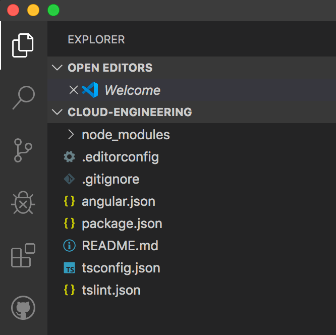
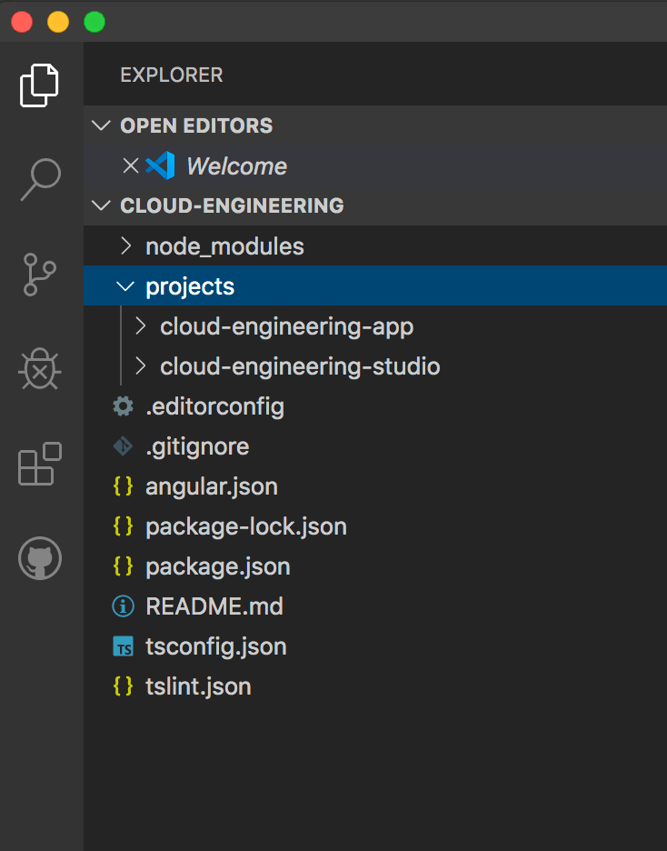
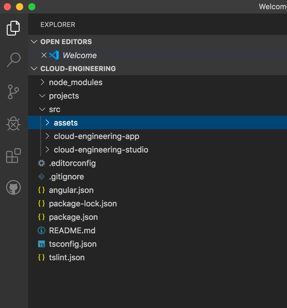
As you probably know, SVGs, or scalable vector graphics, are essential if you’re using simple artwork like icons. But did you know that you can make them into Angular components? In fact, the two libraries I use the most are the ones I created for SVGs and buttons.
Why should you use SVGs?
I started using SVGs because of their ability to scale without any loss in resolution and because I could color them through CSS. (This was useful for a part of the gamified interactive lesson I started where you get to pick a character and make it grow or shrink.)
Note: Only SVGs made with paths and outlines can scale indefinitely. SVGs made with images will get fuzzy.
SVGs are also super lightweight because they are represented in XML, and you can avoid http requests to fetch them!
Liberate yourself from SVG libraries
What I didn’t realize was that my beloved Font Awesome library was costing me almost 20 Lighthouse points and that I didn’t need their large Javascript files to make them into tidy components (instead of unmanageable chunks of text) by turning them into Angular components.
Note: I still subscribe to Font Awesome because of their unparalleled selection. In fact, all of the icons on the sites/apps I make are thanks to their brilliant illustrators.
If you end up using their SVGs or make your own using Illustrator, be sure to delete any styles/comments that are part of the SVG, so that you can properly override them.
Angular components don’t have to use HTML templates
If you want your own Angular SVG library, you can easily turn them into components by linking the templateUrl parameter of your component to the SVG in your asset library. (Font Awesome offers a library to access their SVGs, but you can avoid unnecessary dependencies and weight to your app by going this route. As an added bonus, this approach lets you declare your SVGs once, instead of having to declare them individually in every app that uses them.)
svg-astronaut.component.ts
@Component({
  selector: 'ces-svg-astronaut',
  templateUrl: '../../../../../../src/assets/images/svgs/astronaut.svg',
  styleUrls: ['../../svg.component.scss']
})
Note: Initially, I was storing the assets directly in my Angular library but then moved the SVGs to my apps’ shared assets folder so that I don’t have to modify my angular.json file to use the assets and so that I could access the SVGs outside of the library.
The downside to this decision is that the library won’t work outside of the workspace unless you include the assets folder. Please let me know if you have a better solution.
Be careful on how you link to your SVGs
You can’t link the SVGs using the usual “src/assets” or “/assets” shortcuts, as they require a direct relative path to your app’s source folder. That’s why I had to use a ridiculously long relative path. (Again, I’m sure there’s a better way to achieve this.)
Use the same CSS file for all of your SVGs
I also linked the SVGs to the same CSS file since they all require the same styles, which are required to be able to style them on the fly through the parent that’s using them. By doing so, I just need to update one file to affect all of the components in the future.
svg.component.css
svg {
  width: inherit;
  height: inherit;
  fill: inherit;
  background: inherit;
  background-color: inherit;
}

img {
  width: inherit;
  height: inherit;
}
Note: Don’t forget to include the components in your module’s exports section so that your app can access them. And import the SVG library into the apps that use them.
Clean up unused files
You can delete the html and CSS files that came with your component, as your component won’t be using them.
Use your new component
Now, if I want to use an SVG, I just use the component’s selector:
<ces-svg-astronaut></ces-svg-astronaut>
Because I follow the same naming convention, e.g., prefix-svg-description, I usually don’t have to look up what I called it.
What if you want to dynamically select the SVG?
With some use cases, you won’t know ahead of time which SVG you want to select. Because you can’t make part of the selector dynamic, this feature requires setting up a separate general component.
svg.component.ts
import { Component, Input } from '@angular/core';

@Component({
  selector: 'ces-svg',
  template: `
      <img src="/assets/images/svgs/{{ type }}.svg" [alt]="type + ' icon'" [title]="title">`,
  styleUrls: [
  './svg.component.scss'
   ]
})
export class SvgComponent  {
  @Input() type: string;
  @Input() title:string;
}
Note: This is why I included styles for “img” in the above CSS. To change the color of the SVG image, you need to use these styles on an element:
mask: url('/assets/svgs/astronaut');
background-color: orangered;
Automatically add “alt” tags and dynamically add “title” tags
I included the “alt” attribute to automatically take the icon’s type with the word “icon” so that I didn’t have to specify them individually. However, I made the “title” attribute a variable in case I wanted to add help text that shows upon hover, which will vary depending on the usage.
Use the general SVG component
Now, you can use the same selector and specify which icon you want to use by passing in an icon type. You only have to set up this component once, even if you add/delete SVGs to your library.
<ces-svg type="astronaut">


