Author: Yoko Ishioka

  • How to solve ENOTEMPTY: Directory not empty

    How to solve ENOTEMPTY: Directory not empty

    I recently redesigned my blog’s website and set up the upload process so that I wasn’t dragging files to be uploaded directly from Visual Studio Code. As a result, I started getting this error each time I tried to build the site:

    An unhandled exception occurred: ENOTEMPTY: directory not empty, rmdir...
    

    Since I’m using Angular, I noticed that the ‘dist’ folder (the one Angular publishes your build to) was deleting my assets but not the actual folder like it used to. I found a couple of Stack Overflow threads that offered solutions to bypass this error. Deleting the nodes_modules folder and reinstalling express body parser worked once but the error kept coming back on subsequent builds.

    It turns out that the problem wasn’t a permissions one which I initially suspected. It was acutally quite simple…I just had a finder window open with that directory! Anyway, just thought I’d share since it was such a stupid mistake.

    To resolve the error, all you have to do is close any dialogs that have the ‘dist’ folder open. Whoops!

  • Go faster than navigation with Angular resolvers

    Go faster than navigation with Angular resolvers

    I remember the first time I read about Angular resolvers, they sounded so cool. Let the router prefetch data? Yes, please! But when I tried to follow along the tutorial on Angular’s website, I got a little lost.

    While the writer did a really amazing job of breaking everything down, I kept running into null injector errors because it’s a little different when you go from lazy-loaded library to library rather than straight from a module to your app. And you really need to understand the difference between the router, the activated route, and the router state to truly appreciate how cool Angular resolvers can be.

    What is an Angular resolver anyway?

    Think of an Angular pipe but one you use before the page even loads! That means you can transform or fetch data without having to subscribe to the Activated Route! In other words, no more waiting!

    Resolvers can greatly enhance your app or website experience because they start the moment the user decides to navigate somewhere. In fact, the page won’t even load until your resolver is finished. So, you don’t have to scramble with race conditions and can be prepared for when they arrive.

    Keep in mind we’re talking about milliseconds, so don’t go too crazy. Here are some use cases that I started working on:

    1. Generate and update meta tags
    2. Fetch blog articles
    3. Grab dynamic parameters to conduct search queries
    4. Create navigation menus based on your routing module

    How do they work?

    Imagine having a totally separate service that exists outside of your module act as though it was actually inside of your module. It uses the ActivatedRouteSnapshot and RouterStateSnapshot as arguments to its resolve method, so that it can use the same exact routing data you get with ActivatedRoute and RouterState to send you data.

    Therefore, instead of subscribing to routing events, it has data prepared already for you! All you have to do is add extra parameters to your routing module, like you do with path, component, and data. So at the same level, just add a resolve parameter that states what key to use and which resolver should provide the data. Then, get the activated route’s snapshot to retrieve the data.

    Can you give me an end-to-end example?

    Sure! A while back, I wrote an article about creating a self-updating navigation menu. While I really liked the aspect of updating the route and meta information in one place, I didn’t like having to create multiple menus even if it was super simple and quick to do so.

    So, now to create a navigation menu, I can add the following to my routing module:

        resolve: {
          displayTitle: MetaTagsResolverRouteDataService,
          menu: ResolveMenuService
         },


    Note: ‘displayTitle’ and ‘menu’ are arbitrary values that are only declared here. They will be used as keys when it’s time to find your route’s data.

    You have the option of using the resolver at the module, route, or component level. Remember, if you provide it to a parent route, all of its children can readily access it. However, you might want to keep in mind that it will fire every time a user navigates to that route.

    demos-routing.module.ts

    Next, I added data to the routing module to specify what values to use.

      {
        path: 'select-menus',
        component: DemoSelectMenusComponent,
        data: {
          title: 'Select Menus',
          description: "Cloud engineering demo of customizable select menus",
          menu: {
            icon: 'dropdown',
            label: 'Select Menus',
            show: true,
            activeSelfOnly: true,
          },
        },
       },
    

    resolve-menu.service.ts

    My resolver is super simple. It just parses out the data that’s needed to build the navigation menu and returns it.

    One thing to note is that there can be parent/child hierarchies depending on how you set up your routes. Almost always, my menus will be at the parent level because I want them to be on every page that belongs to their library. You can create a library-specific template with consistent layouts by using Angular’s router outlet.

    import { Injectable } from '@angular/core';
    import { Resolve, ActivatedRouteSnapshot, RouterStateSnapshot } from   '@angular/router';
    import { ResolveMenu } from './menus';
    import { Observable } from 'rxjs';
    
    
    @Injectable({
      providedIn: 'root'
    })
    
    export class ResolveMenuService implements Resolve<ResolveMenu[]> {  
    
      constructor() { 
      }
    
      resolve(
        route: ActivatedRouteSnapshot,
        state: RouterStateSnapshot
      ): ResolveMenu[] | Observable<ResolveMenu[]> {
    
      let menu: ResolveMenu[] = [];
      route.routeConfig.children.map(child => {
         if (child.data.menu)
            menu.push({
            path: child.path,
            show: child.data.menu.show,
            activeSelfOnly: child.data.menu.activeSelfOnly,
            title: child.data.title,
            label: child.data.menu.label,
            icon: child.data.menu.icon
          })
        })
      return menu;
      }
    }
    

    menus.demo.component.ts

    Finally, to see the resolved data, I can call it like so:

    import { Component, OnInit } from '@angular/core';
    import { ActivatedRoute } from '@angular/router';
    import { ButtonRoute } from 'projects/buttons/src/public-api';
    
    @Component({
      selector: 'ces-demos-menu',
      templateUrl: './demos-menu.component.html',
      styleUrls: ['./demos-menu.component.scss']
    })
    
    export class DemosMenuComponent implements OnInit {
    
      buttons: ButtonRoute[] = [];
    
      constructor(
        private route: ActivatedRoute,
      ) {}
    
      ngOnInit(): void {
        this.buttons = this.route.snapshot.data.menu;
      }
    }
    

    The resolved data is stored in the ActivatedRouteSnapshot and RouterStateSnapshot. Just look for whatever key you added when specifying the route, and it will be available in JSON format.

    demos-menu.component.html

    To render the menu, I just pass this.buttons value to the button route component I created to handle routes:

    <nav>
      <ces-menu-toggle class="nav-buttons align-left" menuTitle="navigation" toggleIcon="ellipsis-vertical">
      <ces-button-route *ngFor="let button of buttons" [link]="button.path" [title]="button.title" [label]="button.label" [icon]="button.icon" [activeSelfOnly]="button.activeSelfOnly" class="nav-button">
      </ces-button-route>
    </ces-menu-toggle>
    </nav>
    

    And voila, here is the navigation menu in action. I would normally hide it since it looks silly to have a navigation menu for one item, but will keep it up for now in case you want to take a peek. This way, in the future, anytime I add another demo to this section, the menu will automatically get created.

    Here are the Github Gists if you want to see all of the files together.

    Things to watch out for

    Circular references

    You cannot build a resolver inside of the same library/module that will use it. Likewise, you cannot use a service that’s inside of the library/module nor put your resolver in the same library that the target library uses. This will create a circular reference and Angular is smart enough to let you know.

    For example, I created a data library for my blog service to fetch articles from. I was not able to put the resolver in either of those libraries nor use the blog service to fetch the articles. So, I put my resolver in a routing library that uses the data service to fetch the articles.

    It’s best practice anyway to keep everything in one direction so as not to cause unwanted dependencies.

    No provider errors

    Remember, the resolver is like a floating route. So, if you want to use the resolver other than when the user is navigating to a certain route, pass in the ActivatedRoute and RouterState, not the ActivatedRouteSnapshot and RouterStateSnapshot.

    Hopefully, you enjoyed this article. Thanks for reading it!

  • Allow users to edit the content of any element with this Angular directive

    Allow users to edit the content of any element with this Angular directive

    As a side project, I am working on a note taker/learning aid app built with Angular. One of my main goals is to make it as user friendly as possible, so I decided to make an Angular directive that does the following:

    1. Lets user click on text to edit the contents
    2. Can restrict edits by requiring user to hit the edit icon first, essentially entering an edit mode
    3. Checks whether the text was altered when the input loses focus or when the user hits ‘Enter’
    4. Saves the text if it was altered

    To begin, the directive has the following properties:

      // Use this variable to store the original value
      value: string;
      
      // Use this input if you want to restrict editing to only be allowed in edit mode 
      @Input() allowEdit: boolean = true;
      
      // Use this input if you are saving the change and need to reference the identifier of the change
      @Input() id: number;
      
      // Use this input to indicate what field is being changed
      @Input() update: string;
      
      // Use this output to notify the parent that a change has been made
      @Output() onChange: EventEmitter<EditUpdate> = new EventEmitter();


    For the constructor, you will need:

      // Automatically get a reference to the element you're changing with ElementRef
      private el: ElementRef
      
      // Safely update the element without accessing the DOM directly by using Renderer2
      private renderer: Renderer2


    Detect events with HostListener

    The beauty of using HostListener is that you don’t have to keep track of who is sending the event because as the name implies, it’s the host of whatever you added the directive to. (To me, this is the true power of directives!)

    That means no more redundant code of individually assigning event listeners and then hooking those up to the functions that contain callbacks of what you want to happen when those events are made! No more having to build hierarchical relationships so that you can modify the element in relation to the elements around it!

    I have three HostListeners for this directive because I want to detect when the user clicks on the element, when the user clicks off of the element, and when the user hits ‘Enter’ on the keyboard.

    A HostListener to detect click events

    If you want to toggle editing capabilities, wrap an if statement around the function that’s handling the click event. Because the parent determines whether or not the element should be editable, you don’t have to worry about toggling this variable. (I’ll cover how to reset the variable further down this article.)

    @HostListener("click") onClick() {
      if (this.allowEdit) {
        this.makeEditable();
      }
    }
    

    Some reasons to make editing not automatic by default

    1. You want only certain users with the proper permissions to be allowed to edit the text.
    2. You want the text to be selectable when it’s not being editing.
    3. You want to limit the possibility of accidental edits.

    HostListeners to detect when the user is done editing

    When first making this directive, I spent a lot of time creating a save/undo button interaction that hid/showed other functionality in the different modes but then later scrapped that approach because it required the user to click unnecessarily. After all, nothing is more frustrating than losing all of your work because you forgot to hit save.

    I created one for when the user clicks elsewhere and also another to listen for the ‘Enter’ key.

     @HostListener('blur') blurred() {
      this.checkValues();
    }
    
    @HostListener('keydown', [('$event')]) onKeydown(event) {
      if (event.keyCode === 13) {
         event.preventDefault();
         this.checkValues();
    
      }
    }
    

    Enter Edit Mode

    You can use ElementRef to identify the element rather than querying the DOM and Renderer2 to manipulate it. This function simply adds the editing class to the element, thereby providing visual feedback to the user that it’s now editable.

    makeEditable() {
      this.renderer.addClass(this.el.nativeElement, "editing");
      this.renderer.setAttribute(this.el.nativeElement, "contentEditable", "true");
      this.el.nativeElement.focus();
      this.setValue(this.el.nativeElement.innerText);
    }
    

    Check to see if an edit was made

    Next, set the ‘contentEditable’ attribute to ‘true’. Then, give it focus and save the value of the inner text.

    After the user finishes editing, we’re going to compare the value of the inner text with the previous one to see if there are any changes. That way, we’ll send the data to the parent only if there is a difference and thus reduce the number of unnecessary trips to the database.

    checkValues(): Observable<EditUpdate> {
      const newValue = this.el.nativeElement.innerText;
    
      if (this.value !== newValue) {
        const edit: EditUpdate = {
        id: this.id,
        update: this.update,
        value: newValue
        }
        this.onChange.emit(edit);
      }
      
      this.reset();
      return this.onChange;
    }
    

    Exit Edit Mode

    Don’t forget to reset edit mode by removing the ‘editing’ class and setting ‘contentEditable’ to ‘false.’

    reset() {
      this.editing = false;
      this.renderer.removeClass(this.el.nativeElement, "editing");
      this.renderer.setAttribute(this.el.nativeElement, "contentEditable", "false");
    }
    

    The final product

    Here’s the code all together. Hope you enjoy! https://gist.github.com/yokoishioka/f746f261a86c91ffb2a4ffdeef18a096

  • Combine the power of Angular services and directives to detect screen size changes

    Combine the power of Angular services and directives to detect screen size changes

    I’ve read a lot about how awesome Angular services can be (and they’re right) and have seen a few on directives (there should be way more), but what has really been exciting me lately is how to combine the two!

    Problem to solve

    Detect when the screen size changes from mobile, tablet or desktop to automatically toggle between a navigation menu and hamburger menu.

    Solution requirements

    1. Request and receive the values from anywhere in my Angular workspace without duplicating code or worrying about dependencies.
    2. Request the values from only the components who care about them.
    3. Receive the values as either numbers or device sizes, such as small, medium and large.
    4. Receive the values only if they change.

    Why not just use a service?

    To separate concerns and to be reusable, I created a toggle menu component that doesn’t care what content is inserted and is used by a menu component that only cares about creating the content. If I were to just use a service, both components would have to listen to the service even when the service wasn’t being used and the service would have to care about which state the component is in rather than just focusing on passing values.

    Why use a directive?

    Think of directives as being able to supplement your components without having to create another component to do it. It’s like having a phantom component that can do everything a component can do but without requiring an actual instance of itself. By not including the HostListener in the service, only the element that has the directive will be listening for screen size changes.

    Role breakdown

    Directive: Listens for when the screen width changes and sends those values to the service.

    Service: Receives values from anyone who uses it, categorizes the number by screen size (if requested) and sends values to whoever subscribes to them.

    Component: Tells the directive when to start listening for the changes. Subscribes to the service to get back the values, specifying it only cares when the values change. Determines when to stop sending values.

    The Directive

    Attach the selector to the element you want to listen for window events. You’ll want to include a HostListener for when the window first gets loaded and then also one if the screen gets resized. Then, send the values to the service.

    device-screen-size.directive.ts

    import { DevicesService } from './devices.service';
    
    @Directive({
    selector: '[cesDeviceScreenSize]'
    })
    export class DeviceScreenSizeDirective {
    
    constructor(
      private devices: DevicesService
    ) { }
    
    @HostListener('window:load', ['$event']) onLoad(event) {
      this.sendSize(event.currentTarget.innerWidth);
    }
    
    @HostListener('window:resize', ['$event']) onResize(event) {
      this.sendSize(event.currentTarget.innerWidth);
    }
    
    sendSize(width: number) {
      this.devices.setSize(width);
    }
    }
    

    The Service

    Inside of your service, you’ll want to use an input that will take in the values and pass those values to a subject so that anyone can subscribe to them, even if they aren’t using the directive.

    devices.service.ts

    import { Injectable, Input } from '@angular/core';
    import { Subject, Observable } from 'rxjs';
    import { ScreenSize, DetectType } from './devices';
    
    @Injectable({
      providedIn: 'root'
    })
    
    export class DevicesService {
      screenSize: Subject<any> = new Subject();
      @Input() detectSize: DetectType;
    
      constructor() { }
    
      setSize(width: number): Observable<any> {
        if (this.detectSize === 'number') {
          this.screenSize.next(width);
        }
    
        else {
          if (width < ScreenSize.medium) {
            this.screenSize.next('small');
          }
    
          else if (width > ScreenSize.medium) {
            this.screenSize.next('medium');
          }
    
          if (width > ScreenSize.large) {
            this.screenSize.next('large');
            }
          }
    
      return this.screenSize;
      }
    }
    

    The Component

    For my use case, I created a menu toggle component that needs to detect when the screen size changes so that it knows whether or not to display the hamburger icon instead of the full navigation menu. I specified to the service that I want to listen for device sizes rather than the screen size width because I only care when the device changes.

    I recently discovered the distinctUntilChanged RxJS operator that will only pass the value if it’s changed! How cool is that?? No more useless values clogging up my stream.

    I don’t have to listen for when the device is large because nothing changes between medium and large. And medium always comes in between small and large.

    Don’t forget to unsubscribe from the subject to avoid memory leaks.

    toggle-menu.component.ts

    import { Component, OnInit, Input, Output, EventEmitter, OnDestroy } from '@angular/core';
    import { DevicesService } from 'projects/devices/src/public-api';
    import { distinctUntilChanged } from 'rxjs/operators';
    import { Subscription } from 'rxjs';
    
    @Component({
      selector: 'ces-menu-toggle',
      templateUrl: './menu-toggle.component.html',
      styleUrls: ['./menu-toggle.component.scss']
    })
    
    export class MenuToggleComponent implements OnInit, OnDestroy {
      @Input() showMenuButton: boolean = false;
      @Input() showMenuContent: boolean = false;
      @Input() menuTitle: string = "menu";
      allowToggle: boolean;
      sub: Subscription;
    
      constructor(
        private devices: DevicesService
      ) { }
    
      ngOnInit() {
        this.devices.detectSize = "type";
        this.sub =      this.devices.screenSize.pipe(distinctUntilChanged()).subscribe(size => {
        this.checkSize(size);
      })
     }
    
      ngOnDestroy() {
        this.sub.unsubscribe();
      }
    
      closeMenu() {
        this.showMenuButton = true;
        this.showMenuContent = false;
      }
      
      openMenu() {
        this.showMenuButton = false;
        this.showMenuContent = true;
      }
    
      checkSize(size: string) {
        if (size === 'medium') {
          this.allowToggle = false;
          this.openMenu();
        }
    
        else if (size === 'small') {
          this.allowToggle = true;
          this.closeMenu();
        }
      }
    
      toggleNav() {
        if (this.allowToggle) {
          this.showMenuButton = !this.showMenuButton;
          this.showMenuContent = !this.showMenuContent;
         }  
      }
    }
    

    I also posted the code to GitHub Gist for better readability. You can view the menu in action on my blog’s website. (Expand and shrink the window after you click the link.) Thanks for reading!

  • Celebrate independence with a completely self-sufficient Angular button that can hide any parent

    Celebrate independence with a completely self-sufficient Angular button that can hide any parent

    One of the most fun things about Angular – yes, I said fun AND I’m not being sarcastic – is coming up with ways to create components that are totally modularized and can perform functions with a plug-and-play attitude. For example, I created a button that can hide any parent just by including its component within the component you’re trying to hide.

    Start with a generic button component

    At the heart of every good component are the absolute bare-minimum basics. If you want to take advantage of a modular approach, make sure you are using building blocks that are flexible enough to build upon and that are loosely coupled so that they won’t become restrictive later on. In other words, you want to build components that you can confidently change because you know those changes will be isolated and not cause unintended ripple effects.

    So, the first step is to create a button component that will be the foundation of all of your other buttons. For example, below is the base button component I use for my blog’s website. It gives the developer an option to add whatever content they want for the button, as indicated by Angular’s “ng-content” tag.

    button.component.html

    <button [ngClass]="class" [disabled]="disabled">
      <ng-content></ng-content>
    </button>
    

    Add CSS to your button

    button.component.scss

      @import "src/assets/styles/variables.scss";
    
      button {
        font-size: inherit;
        background: inherit;
        color: inherit;
        text-align: center;
        padding: 0.5em 1.0em;
        border: 1px solid;
        border-radius: $border-radius;
      }
      button:hover {
        filter: brightness(125%);
        cursor:pointer;
      }
    
      button.large {
        padding: 1.0em 2.0em;
        font-size: 2.0em;
        border: $border;
        border-radius: $border-radius;
      }
    
      button.no-border {
        border:0;
      }
    
      button.no-padding {
        padding:0;
      }
    
      .icon {
        width: 3.0em;
        height: 3.0em;
      }
    
      button:disabled {
        opacity: 0.25;
      }
    

    The developer can disable the button by setting the disabled property to true. I added CSS to make the disabled button have an opacity of 0.25 so that it appears disabled as well.

    Instead of hardcoding a color for the hover state, I am setting a filter to make the brightness at 125% so that it can apply to any button no matter what color it is. I also added the cursor to change to the hand, or more precisely pointer, upon hover since that’s not a default behavior.

    The developer can also choose to not have a border or padding.

    button.component.ts

      import { Component, Input } from '@angular/core';
    
      @Component({
        selector: 'ces-button',
        templateUrl: './button.component.html',
        styleUrls: [
          './button.component.scss'
        ]
      })
      
      export class ButtonComponent {
        @Input() class:string;
        @Input() disabled:boolean;
       }
    

    Next, create the button that can hide its parent

    I added inputs for the user to pass the label and opt for the default icon if desired. (This is useful if the developer wants to use the styles that are applied to the button, e.g., font size, padding, icon size, etc.)

    button-hide-parent.component.html

      <ces-button type="button" class="no-border no-padding" (click)="onClose()">
        <span *ngIf="label" class="label">{{ label }}</span>
        <ces-svg-x-circle class="button-close-icon"></ces-svg-x-circle>
      </ces-button>
    

    button-hide-parent.component.ts

      import { Component, Input, Renderer2, ElementRef, Output, EventEmitter } from '@angular/core';
    
      @Component({
        selector: 'ces-button-hide-parent',
        templateUrl: './button-hide-parent.component.html',
        styleUrls: ['./button-hide-parent.component.scss']
      })
      export class ButtonHideParentComponent  {
        @Input() icon: string;
        @Input() label:string;
        @Output() hidden: EventEmitter<any> = new EventEmitter();
    
        constructor(
          private renderer:Renderer2,
          private elem:ElementRef
        ) { }
    
      onClose() {
        const parent = this.renderer.selectRootElement(this.elem.nativeElement.parentNode);
        this.renderer.setStyle(parent, 'display', 'none')
        this.hidden.emit();
      }
    }
    

    By creating an instance of ElementRef, I’m able to easily obtain a reference to the component and therefore get the component’s parent without having to query the DOM. By using Renderer2, I’m able to safely target the parent component and apply the style “display:none.”

    I also added an EventEmitter just in case the parent needs to know that the parent was hidden.

    Use the new button

    To use the new button, include the selector in the HTML template of the component you would like to hide. No additional code is required to make it work.

    Note: You can specify another click event handler on the button in case you want to add another function in the parent’s typescript file. By doing so, clicking the button will invoke both the child’s and parent’s methods.

  • Componentize SVGs in Angular and style them on the fly

    Componentize SVGs in Angular and style them on the fly

    As you probably know, SVGs, or scalable vector graphics, are essential if you’re using simple artwork like icons. But did you know that you can make them into Angular components? In fact, the two libraries I use the most are the ones I created for SVGs and buttons.

    Why should you use SVGs?

    I started using SVGs because of their ability to scale without any loss in resolution and because I could color them through CSS. (This was useful for a part of the gamified interactive lesson I started where you get to pick a character and make it grow or shrink.)

    Note: Only SVGs made with paths and outlines can scale indefinitely. SVGs made with images will get fuzzy.

    SVGs are also super lightweight because they are represented in XML, and you can avoid http requests to fetch them!

    Liberate yourself from SVG libraries

    What I didn’t realize was that my beloved Font Awesome library was costing me almost 20 Lighthouse points and that I didn’t need their large Javascript files to make them into tidy components (instead of unmanageable chunks of text) by turning them into Angular components.

    Note: I still subscribe to Font Awesome because of their unparalleled selection. In fact, all of the icons on the sites/apps I make are thanks to their brilliant illustrators.

    If you end up using their SVGs or make your own using Illustrator, be sure to delete any styles/comments that are part of the SVG, so that you can properly override them.

    Angular components don’t have to use HTML templates

    If you want your own Angular SVG library, you can easily turn them into components by linking the templateUrl parameter of your component to the SVG in your asset library. (Font Awesome offers a library to access their SVGs, but you can avoid unnecessary dependencies and weight to your app by going this route. As an added bonus, this approach lets you declare your SVGs once, instead of having to declare them individually in every app that uses them.)

    svg-astronaut.component.ts

    @Component({
      selector: 'ces-svg-astronaut',
      templateUrl: '../../../../../../src/assets/images/svgs/astronaut.svg',
      styleUrls: ['../../svg.component.scss']
    })
    

    Note: Initially, I was storing the assets directly in my Angular library but then moved the SVGs to my apps’ shared assets folder so that I don’t have to modify my angular.json file to use the assets and so that I could access the SVGs outside of the library.

    The downside to this decision is that the library won’t work outside of the workspace unless you include the assets folder. Please let me know if you have a better solution.

    Be careful on how you link to your SVGs

    You can’t link the SVGs using the usual “src/assets” or “/assets” shortcuts, as they require a direct relative path to your app’s source folder. That’s why I had to use a ridiculously long relative path. (Again, I’m sure there’s a better way to achieve this.)

    Use the same CSS file for all of your SVGs

    I also linked the SVGs to the same CSS file since they all require the same styles, which are required to be able to style them on the fly through the parent that’s using them. By doing so, I just need to update one file to affect all of the components in the future.

    svg.component.css

    svg {
      width: inherit;
      height: inherit;
      fill: inherit;
      background: inherit;
      background-color: inherit;
    }
    
    img {
      width: inherit;
      height: inherit;
    }
    

    Note: Don’t forget to include the components in your module’s exports section so that your app can access them. And import the SVG library into the apps that use them.

    Clean up unused files

    You can delete the html and CSS files that came with your component, as your component won’t be using them.

    Use your new component

    Now, if I want to use an SVG, I just use the component’s selector:

    <ces-svg-astronaut></ces-svg-astronaut>
    

    Because I follow the same naming convention, e.g., prefix-svg-description, I usually don’t have to look up what I called it.

    What if you want to dynamically select the SVG?

    With some use cases, you won’t know ahead of time which SVG you want to select. Because you can’t make part of the selector dynamic, this feature requires setting up a separate general component.

    svg.component.ts

    import { Component, Input } from '@angular/core';
    
    @Component({
      selector: 'ces-svg',
      template: `
          <img src="/assets/images/svgs/{{ type }}.svg" [alt]="type + ' icon'" [title]="title">`,
      styleUrls: [
      './svg.component.scss'
       ]
    })
    export class SvgComponent  {
      @Input() type: string;
      @Input() title:string;
    }
    

    Note: This is why I included styles for “img” in the above CSS. To change the color of the SVG image, you need to use these styles on an element:

    mask: url('/assets/svgs/astronaut');
    background-color: orangered;
    

    Automatically add “alt” tags and dynamically add “title” tags

    I included the “alt” attribute to automatically take the icon’s type with the word “icon” so that I didn’t have to specify them individually. However, I made the “title” attribute a variable in case I wanted to add help text that shows upon hover, which will vary depending on the usage.

    Use the general SVG component

    Now, you can use the same selector and specify which icon you want to use by passing in an icon type. You only have to set up this component once, even if you add/delete SVGs to your library.

    <ces-svg type="astronaut">
  • Trick Angular into thinking all of your apps share the same source folder

    Trick Angular into thinking all of your apps share the same source folder

    If you start a new project using Angular CLI, you will notice that it comes with a default app that has a “src” folder. Angular uses this folder to act as a root location for your app so that you can access the same starting point no matter where you are in your folder structure.

    But what if you want to share the same starting point across multiple apps?

    After realizing how unbelievably awesome Angular is, you may decide that you want to create multiple apps within the same project workspace but for obvious reasons don’t want to duplicate the same assets over and over. It would seem as though you could just create one assets folder that sits one level above your apps, have all of your apps link to it and be fine. However, by clever design, Angular restricts one source folder per app out of the box that won’t recognize anything outside of its source folder, so you will have to do a little more fanagling to override those protective default behaviors.

    Step 1: Create a new project without a default app

    When you create a new Angular project, specify that you don’t want to create a default app with the following flag:

    ng new [workspace name] --create-application=false
    

    Read this great article by Todd Palmer for a further explanation of other uses of this flag.

    Note: Be sure to use a workspace name that is broad enough to encompass all of your apps because you can’t reuse that same name for an app later on. Really, that name won’t really matter but why not have it make sense regardless?

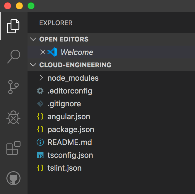
    You will end up with a seemingly barren Angular project that looks like this:

    Create Angular app without a default app

    Step 2: Create your apps

    Create as many apps to your heart’s delight using Angular CLI:

    ng generate app [app name]
    

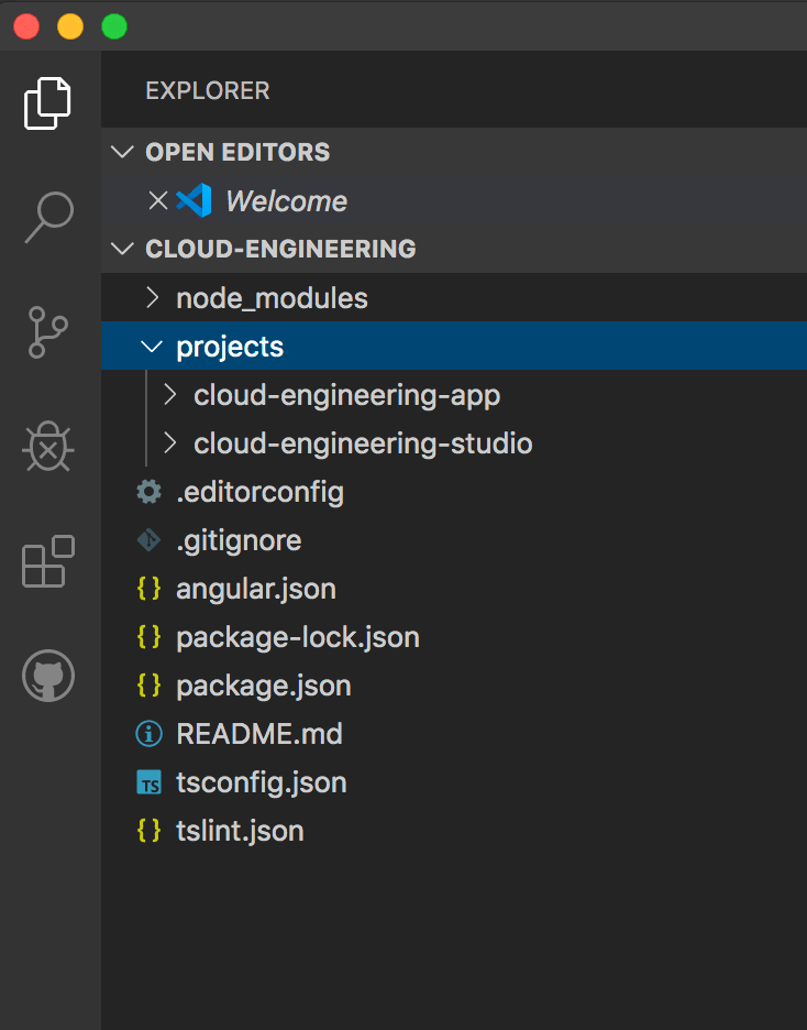
    You will notice that the apps will be created in your “projects” folder, the same as if you were creating a library.

    Create Angular apps

    Step 3: Create a shared “src” folder at the same level as the “projects” folder

    Note: There is essentially no difference in having your apps have “projects” or “src” as their root folder location. However, if you want to easily differentiate your apps from your libraries, you will have to create a shared “src” folder and then drag your apps into that folder.

    Create src folder for your Angular apps

    Step 4: Modify “angular.json”

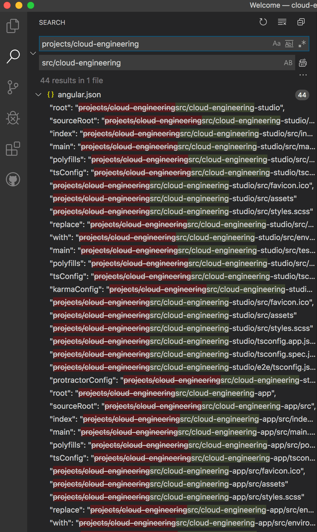
    Do a find-and-replace search for “projects/app-name” to be replaced by “src/app-name.”

    Note: This replacement must be made in all instances of your “angular.json” file (e.g., 44 results for 2 apps), or else your apps will break! Don’t rely on eyeballing on where to make the replacements.

    Find and replace source folder for Angular apps

    Step 5: Create an assets folder

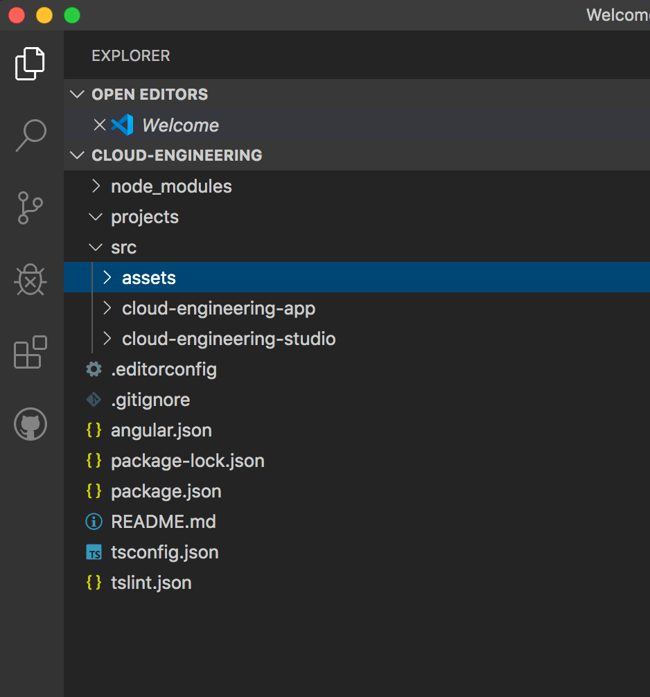
    Create an “assets” folder that sits at the same level as your apps.

    Create shared assets folder for your Angular apps

    Step 6: Modify “angular.json”

    You now have to tell Angular the new location of your “assets” folder by replacing the current assets link with the new one. You can do this by locating the “assets” section in each app and replacing the existing code with the following lines of code:

    Before:

        "assets": [
          "src/cloud-engineering-studio/src/favicon.ico",
          "src/cloud-engineering-studio/src/assets"
        ],


    After:

         "assets": [
              { "glob": "**/*", "input": "src/assets/", "output": "/assets/" },
              "src/cloud-engineering-studio/src/favicon.ico"
            ],
    

    This replacement must be made in both locations for each app because the first location is for the app and the second one is for testing the app.

    Note: Because I want each app to have a different favicon, I kept the different favicon links. If you do so, make sure you reverse the order of the two statements.

    Step 7: Use your new “assets” folder

    Now, you can use your new “assets” folder the same way for each app, and they will all link to the same spot. For example, to link to an image, you can just write:

    "/assets/file-directory/file-name.jpg"


    To import a stylesheet that’s located in the assets folder, you can form your import statement like so:

    @import "src/assets/file-directory/file-name.scss"
    
  • How to create a social media component in Angular for all of your users

    How to create a social media component in Angular for all of your users

    Using Angular means you never have to repeat your code again! For example, I created a social media component that is account neutral so that it can be reused over and over again, even if the user has completely different accounts. I’ve outlined the steps below:

    Step 1: Create an interface called Social Media

    You should take advantage of Typescript’s strong typing capability to indicate what parameters the user will need to provide. I chose to include “link” for a hyperlink to the user’s account and “user” for the account holder’s name.

    export interface SocialMedia {
      link:string,
      user:string
    }
    

    Step 2: Create a social media component

    Use variables in your component’s HTML so that the hyperlink and icon will automatically be created for the user.

    <div class="social-media" [ngClass]="{'vertical':vertical}">
      <div *ngIf="facebook" class="social-media-icon">
        <a [href]="facebook.link" target="_blank" rel="noopener" title="view {{ facebook.user }} on facebook"><ces-svg-facebook></ces-svg-facebook></a>
      </div>
      <div *ngIf="twitter" class="social-media-icon">
        <a [href]="twitter.link" target="_blank" rel="noopener" title="view {{ twitter.user }} on twitter"><ces-svg-twitter></ces-svg-twitter></a>
      </div>
      <div *ngIf="linkedIn" class="social-media-icon">
        <a [href]="linkedIn.link" target="_blank" rel="noopener" title="view {{ linkedIn.user }} on linkedIn"><ces-svg-linkedin></ces-svg-linkedin></a>
      </div>
      <div *ngIf="medium" class="social-media-icon">
        <a [href]="medium.link" target="_blank" rel="noopener" title="view {{ medium.user }} on medium"><ces-svg-medium></ces-svg-medium></a>
      </div>
    </div>
    

    Note: You can make your component even more dynamic by substituting the social platform’s name with a variable and filling all values within a for loop, but I chose to write them out so that it’s clearer to see what’s available.

    Additional note: All of the icons on Cloud Engineering Studio were created by componentizing SVGs I purchased with my Font Awesome subscription.

    Step 3: Create Angular Inputs to accept the necessary values

    I added an additional boolean called “vertical” so the user can specify if they want the icons to be displayed inline.

    export class SocialMediaComponent  {
      @Input() facebook:SocialMedia;
      @Input() twitter:SocialMedia;
      @Input() linkedIn:SocialMedia;
      @Input() medium:SocialMedia;
      @Input() vertical:boolean = true;
    }
    

    Step 4: Use the component

    I included the social media component in the footer of my website.

    <ces-social-media ngClass="social-media-footer" [facebook]="{link: 'https://www.facebook.com/cloudengineeringstudio/', user: 'Cloud Engineering Studio' }" [twitter]="{link: 'https://twitter.com/CloudEngineeer', user: 'CloudEngineer'}" [linkedIn]="{link: 'https://www.linkedin.com/company/cloudengineeringstudio', user: 'Cloud Engineering Studio'}" [medium]="{link:'https://medium.com/@yoko_65687', user: 'Yoko Ishioka'}"></ces-social-media>
    

    And voila, here is what will get rendered:

    Angular social media component example

    Here is a link to the code in Github Gist.

  • Cloud Engineering Studio is now available on Medium

    Cloud Engineering Studio is now available on Medium

    I submitted my first article to Medium, which was picked up by the curators for Javascript AND published by The Startup, Medium’s largest active publication!! Thank you to the Javascript curators at Medium and The Startup for allowing me to share my thoughts!

  • Angular Security Vulnerability: How to fix tree-kill vulnerabilities

    Angular Security Vulnerability: How to fix tree-kill vulnerabilities

    If you’re working in Angular, you may have seen 2 new security vulnerabilities that require you to update the tree-kill package to version 1.2.2 or later. Unfortunately, the usual commands, “npm audit fix” nor “npm update tree-kill” won’t work. (Those commands will update your package.json file but not your package-lock.json file.)

    Thanks to saleem on stackoverflow, below is the solution that will fix your vulnerabilities.

    Solution

    1. Type “npm uninstall tree-kill”
    2. Go to node_modules -> @angular-devkit -> package.json and update the tree-kill version to 1.2.2
    3. Go to node_modules -> @ngtools/webpack -> package.json and update the tree-kill version to 1.2.2
    4. Type “npm install”